How to get the most out of your booking widget
In this article we will briefly describe best practices we have learnt through our gathered data, research and discussions with website experts
Last Update: May 10, 2026
Here's an overview of what we cover in this article:
- Button placement
- Have a Book now button for all your best selling products on your home page
- Arrange your products by categories/themes.
- Choose button colors that stand out.
- Create a detailed page per activity where you have a booking button for that activity.
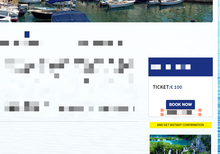
- Place your Book now buttons in prominent places.
- Add multiple book now buttons to pages.
- Test, test and test
- Booking process
- Keep it as simple as possible.
- Use add-ons
- Use after sales tools.
________________________________________________________________________
Button placement
- Have a Book now button for all your best selling products on your home page. These are the products which are guaranteed to attract customers, so chances are that they were either specifically looking to book them or will make them carry on browsing your website further. 🎣

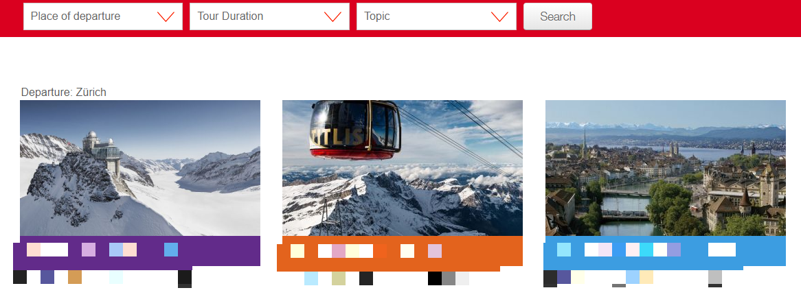
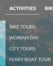
- Arrange your products by categories/themes. You can create an overview page with brief descriptions and book now buttons for each of these. It will help your customers find products easier and they might not want to see all the details of an activity to book it.

- Choose button colors that stand out enough to attract attention, but still match the overall color fullness of your website. Also, make sure that you change the hover color from the default color, so it is clear that this is a call-to-action button.
- Create a detailed page per activity where you have a booking button for that activity specifically. Some of your customers will definitely want to read details, see pictures and see what is included in their trip before making their decision to purchase.
- Place your Book now buttons in prominent places. The most important action a customer can do on your website is making their purchase, make sure it is as easy and visible to find the Book now buttons as possible.

- Add multiple book now buttons to pages. Your customers might read through the entire page they are on, or they might go straight for the purchase, so have a book now button on the top of the page and one on the bottom as well.
- Test, test and test. You could use specific tools for testing different versions of certain web pages like Google Optimize after changing anything with your booking buttons, but even something as simple as keeping track of the number of your bookings after certain changes could give you a good indication on how effective it was.
________________________________________________________________________
Booking process
- Keep it as simple as possible. If possible do not ask for more than the booking person`s first and last name (for eventual charge back claims) as the email address we collect no matter what. Anything more than only ask if it is absolutely necessary for you to have. Do not ask for guest names, emails just because that is the norm.
The more complex your booking process, the longer it takes and the higher the drop-off chance. You can always gather more data via not required custom fields or automatically sending them out after the booking is made. - Use add-ons. You can utilize them by creating free add-ons for highlighting things that would anyways be included in an activity or try to generate extra revenue by offering paid extras such as a photo package or audio guide.
- Use after sales tools. We offer a lot of tools that are often overlooked, such as automated post-trip emails asking for feedback via the platform of your choice or take advantage of our Zapier connection that allows you to connect more than 1200 3rd party applications to your TrekkSoft account. If you are not sure what else is there or how to use certain features you can always reach out to our support team and ask for help or browse through our knowledge base.