Re-designing TrekkSoft's Backoffice: Booking Overview & Booking Details
Get all infos about our re-design project.
Based on our customer's feedback, we are working now for some time in re-designing the most important parts of the TrekkSoft Backoffice.
We will start releasing the first part - Booking Overview - in October 2022.
Afterwards, the re-designed booking details will follow, before we focus on calendar/ schedule view and the guest manifest.
What are benefits of a re-designed backoffice?
The re-designed backoffice parts come with a new look, an intuitive user experience and a cleaner view. During the re-design process we tried to take out complexity, by removing certain actions that can be also done in other places of the backoffice, and simplify the view. All this happened based on our customer's feedback as well as considering data from our analytic tools.
The biggest benefit of the re-design project actually is, that the sections will be responsive and allow you to access it on a mobile device without any difficulties.
How will the Booking Overview section look like?
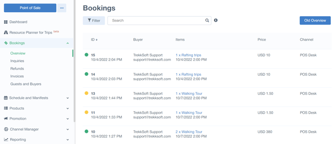
We cleaned up the Booking Overview to show the most important information about the booking, like Booking date, Buyer, Booked Items, Price and Channel.
The colored dots at the beginning of each row do show you the balance status (e.g. green: even; yellow: outstanding).
With one click in the row you can now accesss the booking details. For now this is still showing the existing (old) booking details, but soon, the new booking details will open in a sidebar.

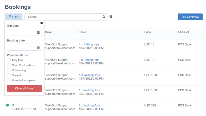
Additionally, we added a filter at the top of the booking overview.
This filter allows you to filter for Booking or Trip Date, as well as for a specific Payment Status.

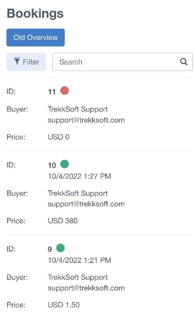
One goal of the re-design project was to make it accesible on mobile devices and simplify your daily operations. This is how the booking overview will look like on a mobile device.

How will the Booking Details section look like?
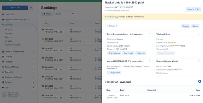
The new booking details page will easily open in a sidebar. This allows you to quickly check the booking and go back to the booking overview in one click.

We will show 4 cards: Buyer information, Price information, Agent and Channel information.
Below this section you find more details, similar to what we currently show in the booking details, e.g. payment history, basket item overview, option to add a payment, refund, etc.
How will the Calendar & Schedule view look like?
As soon as we have updated screenshots to show, we'll share them with you here.