Last update [Oct 2, 2022]
Why BI tools should be an important part of your business?
Business Intelligence Tools provide you the option to analyse different data from different sources, e.g. data from your TrekkSoft system like sales or turnover reports, data from your website like Google Analytics or Ad words data and data from other tools like till systems.
With BI tools you can either analyse specific data or cross reference data from different sources to get a more complete picture of what marketing initiatives are successful, what is driving sales, etc.
With analyzing our data you will not only implement a data driven mindset within your company and team and be transparent about numbers. In the end it's also the team that needs to understand what drives sales and how they can support this in the best way. Additionally you'll be able to drive better business decisions based on data.
Example: You can easily compare data on a year-to-year basis and see which activities and tours were performing best last season compared to this season. Based on this information you'll probably raise the price for a specific tour that was very popular and lower the price for another tour that had less bookings, offer a discount or maybe get rid of the tour from your overall portfolio.
In the following section we will present you two free Business Intelligence tools: Google Data Studio and Power BI.
Google Data Studio
Google Data Studio is provided and supported by Google. To use it you need a google account.
In Google Data Studio you first have to add data from sources you use (Data Sources), e.g. sales report from TrekkSoft by uploading a report (csv or excel) or connecting to a google sheet in your account or which was shared with your account.
You can also connect directly to various tools, e.g. inhouse Google tools like Google Analytics or Google Ad words, or tools like Mail chimp or Hubspot.

Based on those sources you create your Reports in Google Data Studio. In the report section you can use different charts (e.g. pie chart, bar chart, tree map, table) to visualize your data in the best way. Drag and drop available fields from your data sources from the right side into your charts and start to visualize them. Also think about the right titles, legend details, etc.
Feel free to share your data sources and reports with other team members and use different permissions (edit, view) to limit the rights to edit specific data or charts.
Additionally, check out the Google Academy which is offering a detailed introduction into Google Data Studio.
Power BI
Power BI is provided and supported by Microsoft. You can either use the online version or download the desktop version on your computer. Compared to Google Data Studio you can only share data sets and reports/ dashboards with other team members when you use the premium account (10$ p. month). But if you use the same login in your team, Power BI is a good alternative too.
To start, you have to add Datasets into Power BI, either by uploading csv files (e.g. TrekkSoft reports) directly into Power BI or by connecting to one of the applications Power BI offers a direct connection, e.g. Mailchimp, Zendesk, Salesforce.
Once uploaded, you can easily edit this data and remove columns you don't need, merge certain information or change the format, e.g. of the booking and accounting date. For more advanced users there is also the option to set up Power Queries which will automatically, based on the query, change you data.
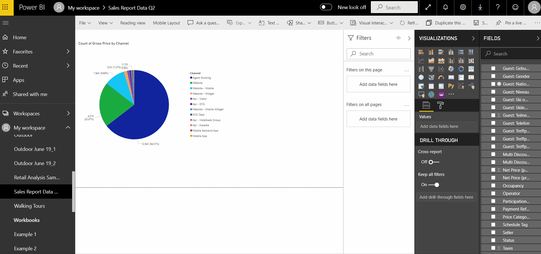
As soon as your data sets are edited and ready, you can start to create Reports. Here you have a big variations of different charts to visualize your data. Just simply chose a chart type and tick the specific fields in the right column you wanna visualize.
Afterwards you can also filter data (e.g. only certain activities) and edit chart labels.
Additionally, check out the Power BI Documentation which is offering a detailed introduction into Power BI.